App Store Launch
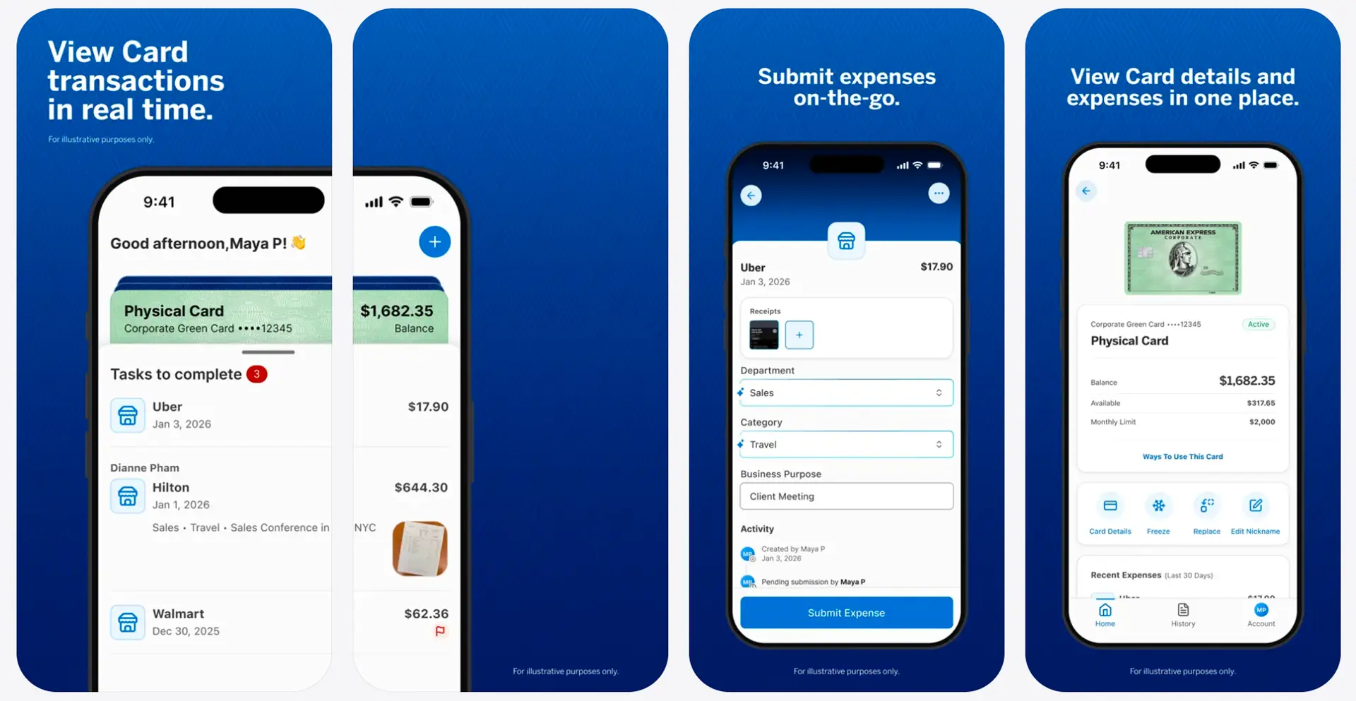
Five screens. One new way to introduce Amex Expense.
the project
Amex Expense Mobile App.
the moment
a new app launch.
the work
five App Store screens.
the outcome
designed and shipped.
the launch
from product to first impression.
The final direction didn't happen all at once. Each round explored a different balance of product clarity, brand expression, and storytelling. Drag through the timeline to see how the design evolved.
design evolution · drag to scrub
01 / 07
Old
The original design on the App Store before our launch.
the breakdown · three paths
where it started, where I dreamed, where it shipped.
Tap a card to open it up and see the annotated details.
in short · my summary
three days, a lot of direction.
This project went from a last-minute ask to submission in just three fast-paced days. I was chosen to lead the design direction, working closely with a senior designer and our director to explore 100+ variations, navigate a lot of “no’s,” and quickly turn feedback into the next direction. After two final rounds with our OnBrand agency, the final designs launched on the App Store.
My biggest takeaway was learning not to get too attached to any one direction, especially under pressure. Explore widely, listen closely, let ideas go quickly, and keep pushing until the right one emerges.
credits · amex expense
made for the launch.
- app store designAmex GCS + OnBrand
- productamex expense mobile app ↗
up next · 02
Centurion Coaching ↗got a product worth designing for?
let's make a first impression
worth remembering.
from no where, to now here.