Spotify Flo
A concept feature that puts live music mixing in every listener's pocket — no decks, no price tag, no expertise.
the question
what if mixing was one tap?
the friction
DJs cost. gear bulks. hosts scramble.
the shape
AI feature inside spotify.
the win
a full clickable prototype + film.
chapter 01
the vision · music at the door
Music can make or break a room. It's the difference between a dance floor and an awkward silence — and yet the people mostly responsible for that difference (hosts, friends throwing dinner parties, small event organisers) are almost never trained DJs.
The starting question was small enough to write on a napkin: what if music mixing was available to everyone, with just one tap?
"a DJ, in your pocket."
chapter 02
the process · three milestones
The build broke into three honest milestones — each one had to be real before the next made sense. Foundation, then enhancement, then a prototype real enough to test in someone's hand.
The foundation was mostly music theory: understanding that every song is built from beats, bars and phrases, and that a good transition lives at the seam between two sections — not in the middle of them.
M1 · Building a music foundation
every song runs on a grid: 1 beat → 1 bar (4 beats) → 1 phrase (4 bars / 16 beats). the grammar under every track.
M2 · Enhance the experience of the feature
Experiment how the user’s mixing process can be simplified using workshops and wireframes
M3 · Prototyping a practical solution
Design a high-fidelity functional prototype and product launch video
M1 FOUNDATIONS · UNPACKED
before flo could mix, it had to read a song.
the grid under every song
all songs share the same repeating structure — beats, bars, and phrases. one bar is four beats, one phrase is four bars (sixteen beats). once flo can count the grid, everything else is measurement, not magic.
1 phrase = 4 bars = 16 beats
predictable sections
identifying sections by ear is slow. but most pop songs reuse the same skeleton: intro → verse → pre-chorus → chorus → bridge → interlude → outro. that predictability is what tells flo where a transition is even allowed to live.
intro · verse · chorus · bridge · outro
labeling the seams
for each section, count the bars: intro (9), chorus (8), verse 1 (15), pre-chorus (8)… that map is the whole trick — smooth transitions can only happen at a section end, on the downbeat of the next.
smooth mix = section end + downbeat
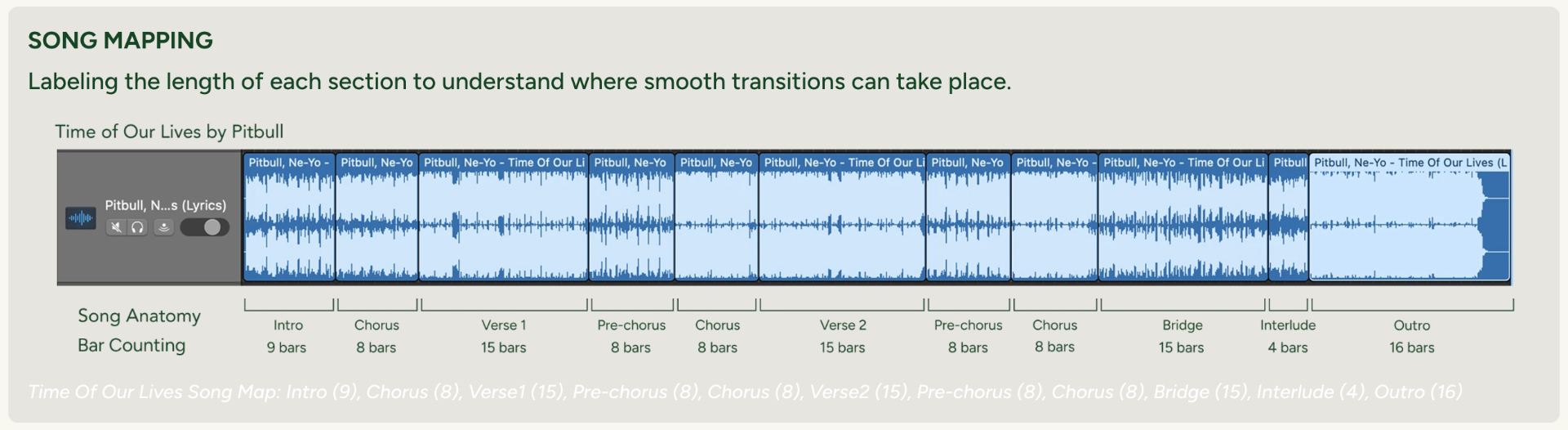
a real breakdown from the research — every section of the track counted in bars, so the app knows exactly which seams are safe to mix on.
M2 ENHANCEMENT · WORKSHOP
sketches in hand, users at the table.
A hands-on workshop turned early sketches into real feedback — testing usability, surfacing new ideas, and pointing out where the flow still tripped people up.
Before the workshop, I drafted three low-fidelity mockups covering the core flow — playing a track and skipping between sections, browsing a queue, and preselecting the exact section where a blend should happen. These were the stimulus every participant reacted to, sketched over, and pulled apart.
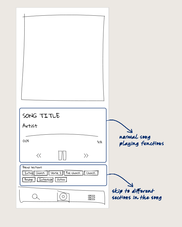
skip by section, not by second
normal playback controls, with a strip of blend-section chips (intro, chorus, verse 2…) so users can jump straight to the part of the song they want.
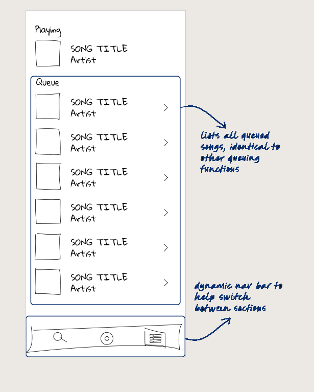
familiar queue, dynamic nav
the queue looks like every other Spotify queue on purpose — the new work happens in the dynamic bottom nav that swaps as the user moves between sections.
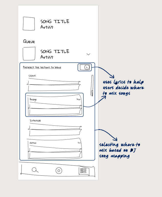
lyrics as the mixing map
for the next track, the user preselects which sections to blend on — lyrics visualised as waveform strips, so the decision is based on the actual DJ song map.
evaluate sketch usability, generate new ideas.
Four participants, one round of low-fidelity sketches, four things to measure — is the mixing flow actually simpler in a stranger's hand?
tool tips & preview
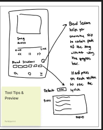
hard-press each section to see the lyrics; small tool tips that guide first-time users through the blend path.
AI-suggested reorder
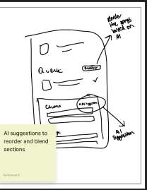
let the app propose which sections to blend, and reorder the queue on the fly based on the track's shape.
tilt-to-blend gesture
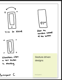
physical gesture — tilt the phone to trigger a blend, with a haptic tap the moment a new section starts.
party-mode toggle
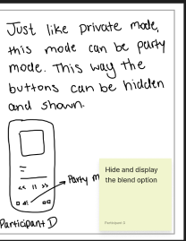
like private mode, but for hosts — hide the blend controls once the room is going, show them again on demand.
- jumping between song sections
- sections don't seem clickable
- add tooltips for guidance
green works · red breaks · yellow to fix
- simple and intuitive queue setup
- no way to test transitions
- add a 'preview' button
green works · red breaks · yellow to fix
- preselect blend sections by lyrics
- lyrics toggle was hard to find
- turn toggle into a default option
green works · red breaks · yellow to fix
wins in green, breakages in red, quick fixes in yellow — a clean map of what the M3 prototype had to solve.
M3 PROTOTYPE · HIGH FIDELITY
from wireframe to workflow, a mix in every pocket.
The final artifact is a highly engaging short promo built in Rotato and DaVinci Resolve, the kind of thing a product team could react to in a room, not just on a slide.
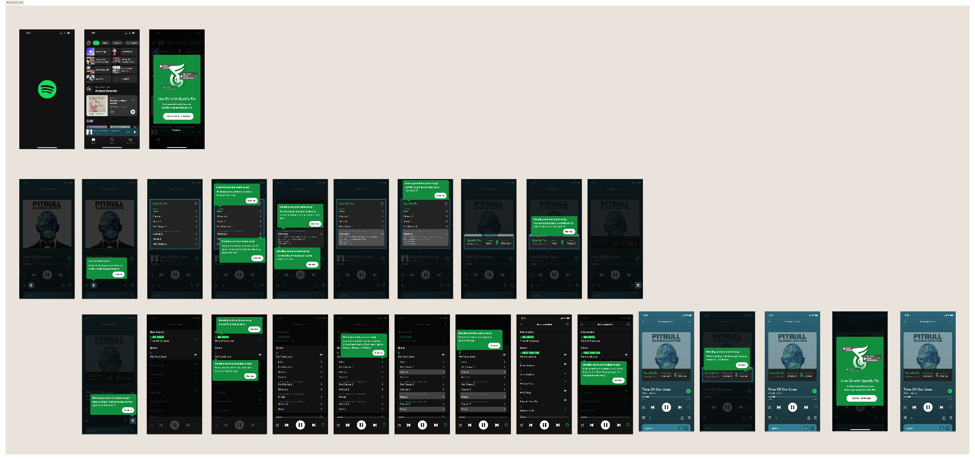
the full prototype screen matrix — every state from splash to live blend, mapped as a clickable Figma flow and rendered as a device mockup film.
M3 · EVALUATION · USABILITY TESTING
five pairs of hands, then a listen back.
Same prototype, five participants, one scripted flow — find the entry point, choose a section, confirm the blend, read the result, edit the selection. Sessions were scored against a shared rubric so friction was measurable, not anecdotal.
Evaluation Criteria
What we watched for while users navigated and used the Spotify Flo feature — a mix of task performance and emotional signal.
Task Findings
Testing Insights
✅ what's working
- Users love the idea and personalization
- Blend previews spark delight
- Flo feels unique and Spotify-native
⚠️ area's to improve
- Scale up the Flo entry point so it's easier to spot
- Make the section selector read as a dropdown at a glance
- Add an explicit confirm action after choosing a blend
- Enlarge edit controls to hit comfortable tap targets
design north star
"make mixing feel like one tap, not one talent."
— the thread from research, through the workshop, into every tested screen.
chapter 04
creating the wow
The final artifact is a highly engaging short promo built in Rotato and DaVinci Resolve, the kind of thing a product team could react to in a room, not just on a slide.
Watch the short promospotify business impact
higher conversions
exclusive mixing could nudge free users toward premium.
expanded reach
casual listeners and music nerds, in the same feature.
new monetisation
premium mix packs, artist-curated transitions, AI blends.
milestones
foundation · enhance · ship
03
months
solo, end-to-end
05
artefacts
prototype & promo
figma + film
credits · spotify flo
a solo mix of research, design, and small filmmaking.
- product & interactionaashika parekh
- prototypefigma · rotato
- promo filmdavinci resolve
- mixing referenceyouDJmixer
up next · 01
Centurion Coaching ↗got a concept worth prototyping?
let's make an idea real enough
to react to.
from no where, to now here.